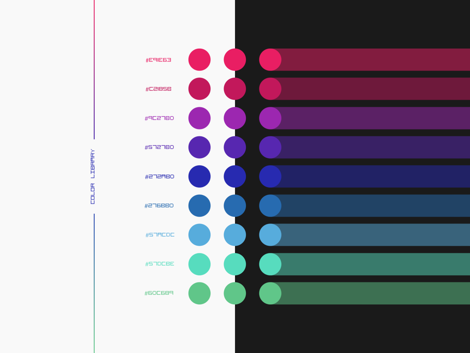
In the modern world of website design, navigating between light and dark modes has become commonplace. But with this shift, a question arises: how do we ensure that links remain clear and easily accessible in both modes? While black text on white background often suffices for light mode, the same principle doesn’t translate seamlessly to dark mode. Finding the perfect link color that shines brightly on a dark background while maintaining a subtle elegance in light mode is a challenge that many designers face. This article delves into the intricacies of choosing the optimal link color for both light and dark modes, ensuring your website remains user-friendly and visually appealing.

Image: www.pinterest.com
The importance of choosing the right link color lies in user experience. A visually distinct link color acts as a clear signal for users, guiding them through the website with ease. Whether it’s a simple click to read more or navigating to another section of your website, the link color should stand out, encouraging users to explore further. In this article, we will discuss different aspects of link color choices, from psychological effects to color contrast and accessibility considerations, enabling you to craft the perfect link color that enhances user engagement and satisfies aesthetic needs.
The Psychology of Color
Before delving into specific colors, it’s crucial to understand the psychological effects of colors on user perception. Color plays a significant role in web design, affecting user emotions, actions, and overall experience. Blue, often associated with trust and reliability, often makes an excellent choice for call-to-action buttons. Green evokes a sense of nature and growth, often used for positive messages and promotions. Red, on the other hand, is commonly associated with urgency and excitement, often used for highlighting deals or discounts. While these associations are not absolute and can vary based on cultural context, understanding these psychological implications is essential when selecting a link color.
Color Contrast for Accessibility
Accessibility is paramount in web design. The Web Content Accessibility Guidelines (WCAG) provide comprehensive guidelines for making websites accessible to users with disabilities. One of the crucial aspects of accessibility is color contrast. Links and surrounding content need sufficient contrast to be easily discernible. For users with visual impairments, poor contrast can make reading and navigating the website challenging. The WCAG recommends a minimum contrast ratio of 4.5:1 for standard text and links.
Choosing the Right Link Color for Light and Dark Modes
Now, let’s dive into the core topic of choosing link colors for both light and dark modes. The goal is to find a color that works well in both modes while maintaining good contrast and a visually appealing aesthetic. Here’s a breakdown of factors to consider and some best practices:

Image: dribbble.com
Light Mode
In light mode, the goal is to strike a balance between visibility and subtlety. While a bright link color like blue might stand out, a more muted hue can blend better with the overall design. Often, a dark blue or purple works effectively for light mode, providing good contrast without being overly aggressive.
Dark Mode
Dark mode presents a slightly different challenge. The chosen link color should stand out against the dark background while maintaining a color scheme that complements the overall design. Some popular choices for dark mode include:
- Light blue: Often used for call-to-action buttons, light blue offers a refreshing contrast against a dark background.
- White: Although white might appear harsh on a dark background, it provides excellent contrast and can be softened with subtle shadow effects.
- Green: A lighter shade of green can offer a fresh and vibrant contrast, making links easily noticeable.
Testing and Iteration
Choosing the perfect link color is an iterative process. Once you’ve selected a few potential options, it’s essential to test them on both light and dark modes with real users. Observe their reactions and gather feedback on the clarity and usability of the links. You can also use tools like contrast checkers to ensure the chosen colors meet accessibility standards. User feedback and continued testing will help you fine-tune your link color choices and optimize user experience.
Experimenting with Hover Effects
Hover effects offer a unique opportunity to enhance the visual appeal and usability of links. When users hover their mouse over a link, a slight change in color or opacity can provide immediate visual feedback, communicating interactivity and guiding users seamlessly. Popular hover effects include:
- Darker shade of the base color: This effect provides a subtle shift, subtly indicating the link’s interactivity.
- Shifting to a complementary color: This option creates a more dramatic effect, making the link visually pop on hover.
- Adding a subtle shadow effect: A subtle shadow can create a depth illusion, enhancing the link’s appearance on hover.
The Importance of Consistency
Consistency is key when choosing link colors. Once you’ve decided on the primary link color for light and dark modes, maintain this consistency throughout your website. Avoid introducing different link colors on various pages or sections, as this can confuse users and negatively impact navigation. Consistent link colors will create a unified visual experience and enhance the user’s overall understanding of the website.
Best Link Color For Light And Dark Modes
Conclusion
The best link color for light and dark modes is not a one-size-fits-all solution. It involves careful consideration of color psychology, accessibility guidelines, and user feedback. By understanding the interplay of these factors and experimenting with different options, you can create links that guide users effortlessly, enhance website navigability, and complement the overall design aesthetic. Remember, the key lies in finding the perfect balance between visibility, contrast, and a visually pleasing experience, ensuring every click is a seamless and satisfying journey for your users.

:max_bytes(150000):strip_icc()/OrangeGloEverydayHardwoodFloorCleaner22oz-5a95a4dd04d1cf0037cbd59c.jpeg?w=740&resize=740,414&ssl=1)


