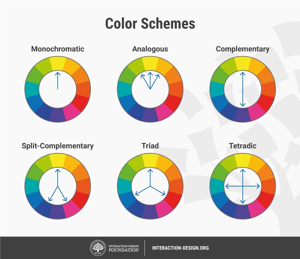
Have you ever noticed how certain colors seem to naturally complement each other, creating a sense of harmony and visual appeal? This phenomenon is often observed in nature, where the vibrant hues of a sunset blend seamlessly, and the lush greens of a forest create a soothing backdrop for vibrant wildflowers. The secret behind this harmonious pairing lies in the concept of analogous colors—colors that sit side-by-side on the color wheel.

Image: www.interaction-design.org
Understanding analogous colors is crucial for artists, designers, and anyone interested in creating visually pleasing compositions. These color combinations offer a range of possibilities for expressing emotions, creating depth, and achieving a balanced aesthetic. In this article, we will delve into the fascinating world of analogous colors, exploring their history, significance, and practical applications.
The Color Wheel: A Foundation for Understanding Harmony
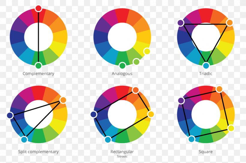
The color wheel is a fundamental tool in art and design, illustrating the relationships between colors. It’s a circular representation of the visible spectrum, typically composed of 12 primary, secondary, and tertiary colors. Analogous colors occupy a crucial position on the color wheel, residing next to each other, forming a harmonious trio. For instance, green, blue-green, and blue form an analogous color scheme, as do red-orange, orange, and yellow-orange. The proximity of these colors on the color wheel signifies their visual kinship, creating a sense of unity and flow.
A Historical Perspective: From Ancient Times to Modern Art
The concept of analogous color harmony has been recognized and utilized throughout history, spanning across various cultures and artistic disciplines. Ancient civilizations, like the Egyptians and Greeks, incorporated analogous colors extensively in their art and architecture. For example, the vibrant blue and green hues found in Egyptian murals and the serene blues and greens of ancient Greek temples underscore the long-standing appreciation for these color combinations.
Renaissance artists, such as Leonardo da Vinci and Raphael, embraced analogous color schemes to create depth and realism in their paintings. These masters utilized subtle variations within analogous color palettes to depict form and light, adding richness and complexity to their works. Analogous color harmony continued to influence subsequent artistic movements, including Impressionism and Post-Impressionism. Artists like Claude Monet and Vincent van Gogh used these color combinations in their landscapes to evoke atmosphere and emotion. Monet’s water lily paintings, for instance, showcase the delicate interplay of blue, green, and yellow-green hues to portray the serene beauty of nature.
Unlocking the Power of Analogous Colors
Analogous color schemes possess a unique ability to create a sense of visual harmony and evoke specific emotions. These colors naturally flow into each other, creating a cohesive and pleasing aesthetic. Their close proximity on the color wheel ensures that they share common characteristics, resulting in a subtle and balanced visual experience. Unlike contrasting colors, which create visual tension and excitement, analogous colors promote feelings of tranquility, serenity, and unity.

Image: favpng.com
Applications in Design and Art
Analogous colors find widespread application across various creative fields, including art, design, fashion, and interior design. Their versatility and inherent harmony make them ideal for a range of projects, from creating a restful ambiance in a bedroom to crafting visually captivating websites.
Art & Painting
Artists frequently utilize analogous color schemes to create depth, movement, and visual interest in their paintings. By subtly varying the tones within the analogous palette, artists can highlight specific areas, add dimension to objects, and guide the viewer’s eye through the composition. For example, a landscape painting might incorporate shades of blue, green, and blue-green to depict the depth of the forest, the shimmering surface of a lake, and the hazy atmosphere of a distant mountain range.
Interior Design
Analogous color schemes are a popular choice for interior design, as they create a sense of calm and harmony. They are often used to create a cohesive and inviting atmosphere in living rooms, bedrooms, and other living spaces. For instance, a living room might feature a palette of warm browns, oranges, and yellows, evoking a sense of comfort and coziness. Alternatively, a bedroom might incorporate cool blues, greens, and teal to promote relaxation and tranquility.
Fashion
Analogous colors are frequently employed in fashion design to create visually appealing and harmonious outfits. They create a sense of flow and continuity, making the wearer appear effortlessly stylish and put-together. For example, a sophisticated outfit might combine a navy blue blazer, a light blue shirt, and denim jeans. The subtle variations within the analogous color scheme create a balanced and cohesive look.
Website Design
In website design, analogous colors are commonly used to establish a specific brand identity, create visual hierarchy, and guide user interactions. By using analogous colors for buttons, navigational elements, and other key components, designers can ensure a consistent and visually appealing user experience. For example, a website for a spa might incorporate calming shades of blue, green, and teal to create a serene and relaxing atmosphere, while a website for a tech company might use a palette of bold blues, purples, and greens to convey innovation and dynamism.
Creating Analogous Color Schemes
Creating harmonious analogous color schemes is a relatively straightforward process. Once you have chosen your primary analogous color, you can explore the neighboring colors on the color wheel to create a balanced palette. Here are a few tips for creating successful analogous color schemes:
- **Start with a primary color:** Choose a color that resonates with you and reflects the overall mood or theme you want to convey.
- **Identify the neighboring colors:** Locate the two colors that sit adjacent to your primary color on the color wheel. These will be your analogous colors.
- **Experiment with hues and tones:** Once you have your analogous color scheme, experiment with different hues and tones within those colors to add depth, complexity, and visual interest. You can incorporate darker or lighter shades, as well as warmer or cooler variations, to create a unique and balanced palette.
- **Consider the balance of light and dark:** Ensure that you have a balanced ratio of light and dark colors within your scheme to create a visually pleasing and harmonious composition.
- **Don’t be afraid to experiment:** The beauty of analogous color schemes lies in their adaptability. Feel free to create your own unique variations by adding pops of complementary colors or experimenting with different saturation levels.
Colors Next To Each Other On The Color Wheel
Further Exploration
The exploration of analogous colors is an ongoing journey that continues to inspire artists, designers, and enthusiasts alike. As you delve deeper into this fascinating world, consider exploring resources that offer detailed insights on color theory, such as books by Johannes Itten, Josef Albers, and Betty Edwards. Don’t hesitate to experiment with different analogous color schemes and discover the endless possibilities that these harmonious combinations offer.
By understanding analogous colors and their role in creating visual harmony, you can elevate your creative endeavors, whether you are an artist, designer, or simply someone who appreciates the beauty of color. Embrace the magic of analogous hues and unlock the potential for creating visually stunning and emotionally evocative works.

:max_bytes(150000):strip_icc()/OrangeGloEverydayHardwoodFloorCleaner22oz-5a95a4dd04d1cf0037cbd59c.jpeg?w=740&resize=740,414&ssl=1)


