Imagine you’ve just created a beautiful chart in Google Sheets, meticulously crafting data and designing the visualization. However, you realize the default colors don’t quite resonate with the information you’re presenting. A dash of color can make the difference between a chart that’s simply informative and one that truly captures attention. So, how can you customize those colors to perfectly match your vision? This guide will walk you through the simple yet powerful steps of changing the colors of your Google Sheets charts, empowering you to create visually engaging and impactful presentations.

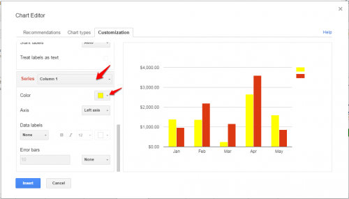
Image: www.tech-recipes.com
Whether you’re looking to add a touch of vibrancy to a basic bar chart or revamp a complex line graph, understanding how to change chart colors in Google Sheets is essential. It allows you to communicate your data effectively, enhance data analysis, and create presentations that truly stand out. So, let’s dive into the world of Google Sheets chart customization and learn how to unleash the full potential of your visual representations.
Coloring Your Charts: A Step-by-Step Guide
Step 1: Selecting the Chart
The first step is to select the chart itself. Click anywhere within the chart’s area to highlight it. A box with a “Chart Editor” button should appear in the top-right corner of the chart. If you don’t see it, click on the “Chart Editor” option in the menu that appears when you right-click on the chart.
Step 2: Accessing the Chart Editor
Click on the “Chart Editor” button to open the customization panel. This panel offers a wealth of options to tailor your chart to perfection. Let’s focus on the “Customize” tab to dive into the palette of possibilities.

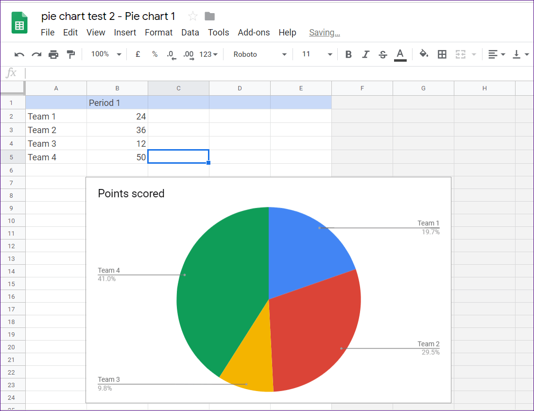
Image: www.guidingtech.com
Step 3: Customize the Chart Colors
Within the “Customize” tab, you’ll find various sections, including “Chart Style,” “Series,” and “Legend.” Navigate to the section that corresponds to the visual elements you want to modify. For instance, if you want to adjust the color of the bars in your bar chart, go to the “Series” section.
Step 4: Changing the Chart Colors
Here’s where the magic happens. Under “Series,” you’ll find “Color” and “Fill Color.” Click the color box next to “Color” or “Fill Color” to bring up a spectrum of colors. You can either choose from the pre-selected color palette or use the color picker to find your desired hue. To achieve a more precise shade, experiment with the color sliders below the color picker.
Step 5: Exploring Color Options
For even more creative control, explore the “Advanced Edit” option within the color menu. Here, you can input specific hexadecimal color codes to achieve precise shades and match specific brand palettes. This empowers you to create visually coherent charts that align with your brand identity.
Step 6: Applying Your Changes
Once you’ve chosen your colors, simply close the color picker, and your changes will be automatically applied to your chart. The updated colors will be reflected in your visualization in real time, providing instant feedback on your design choices.
Step 7: Experiment and Refine
Don’t be afraid to experiment! Google Sheets offers a wide range of colors and effects. Playing with different combinations allows you to find the perfect balance that communicates your data effectively and enhances your chart’s visual impact.
Beyond Basic Colors: Adding Depth and Dimension
While changing the base colors of your chart is an excellent starting point, Google Sheets offers more advanced customization options to create truly eye-catching visualizations. Let’s explore some of these exciting possibilities.
Adding Gradient Effects
For a more dynamic look, try adding gradient effects to your chart elements. Under the “Fill Color” option, you’ll find “Gradient” and “Opacity.” Explore different gradient types and experiment with blending multiple colors to create visually captivating transitions.
Applying Transparency
Adjusting the “Opacity” allows you to make chart elements more or less transparent. This technique can be particularly useful for stacking different layers or creating an overlay effect that highlights certain data points while keeping others visible in the background.
Using Advanced Chart Styles
Google Sheets offers a variety of pre-set chart styles. While default styles are a great starting point, you can customize these styles to match your preferred color palette and create unique visual representations. Experiment with different styles and see which ones best suit your data and presentation needs.
Understanding the Importance of Color in Data Visualization
Choosing the right chart colors is not just about aesthetics; it’s crucial for effective data communication. The right color scheme can help viewers understand complex data relationships and draw meaningful insights. Here’s how color plays a vital role in data visualization:
Color and Perception:
Color can influence our perception of data. Certain colors evoke specific emotions and associations. For example, red is often associated with danger or urgency, while green is associated with growth and positivity. Understanding these associations can help you choose colors that effectively highlight critical trends or areas of interest.
Color and Contrast:
High contrast between data points and chart backgrounds ensures clear readability. It prevents information from being lost in a sea of similar shades. Ensure your color choices create sufficient contrast for your audience to easily discern data categories and trends.
Color and Accessibility:
Consider colorblindness when making color choices. While Google Sheets offers a colorblind-friendly mode, choosing a color palette that accommodates individuals with varying color perceptions is always a good practice. Choose color combinations that are distinguishable even when viewed by people with color blindness.
How To Change Color Of Chart In Google Sheets
Conclusion
Mastering the art of changing chart colors in Google Sheets opens a world of possibilities for data visualization. From basic color tweaks to adding depth and dimension with gradients and transparency, you have the power to create impactful and memorable presentations. Remember, the right color choices not only enhance visual appeal but also contribute to clear and effective data communication. So, experiment, refine, and unleash the full potential of Google Sheets to create charts that not only present data but tell compelling stories.

:max_bytes(150000):strip_icc()/OrangeGloEverydayHardwoodFloorCleaner22oz-5a95a4dd04d1cf0037cbd59c.jpeg?w=740&resize=740,414&ssl=1)


