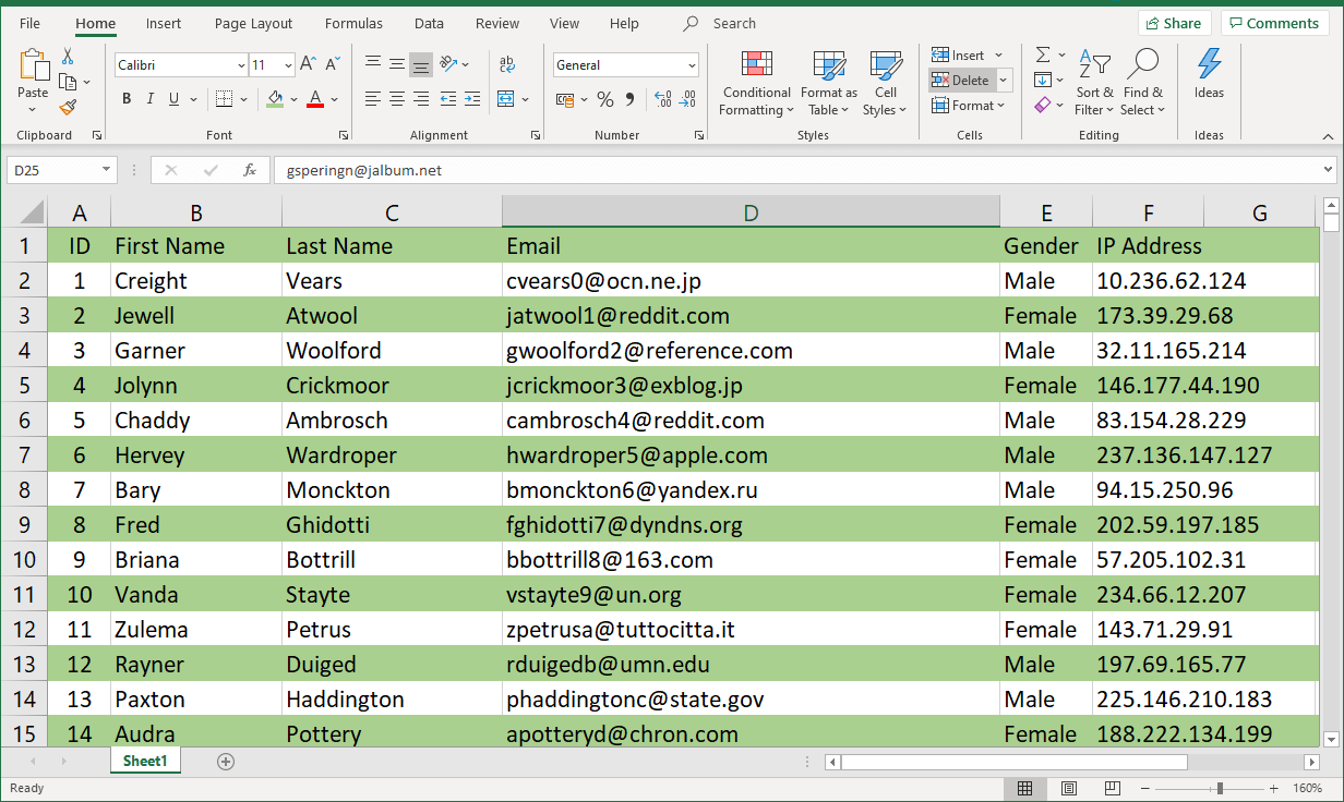
Have you ever stared at a spreadsheet, drowning in a sea of data, feeling like you’re about to lose your mind? We’ve all been there. Sometimes, when you have a massive amount of information to sift through, it can feel like trying to find a needle in a haystack. But what if there was a way to bring order to the chaos, to make your data visually appealing and easy to navigate? That’s where the power of alternating row colors comes in, transforming your spreadsheets from drab to delightful and boosting your productivity in the process.

Image: printableformsfree.com
In this article, we’ll delve into the world of Excel row coloring, exploring why it’s a lifesaver for data organization and learning the simple steps to implement this formatting trick. Whether you’re analyzing sales figures, managing budgets, or simply trying to keep track of your to-do list, coloring every other row can be your secret weapon for turning spreadsheets from intimidating data dumps into visually engaging and efficient tools.
The Art of the Alternating Row: Why It Matters
So, why color every other row? It might seem like a small detail, but this seemingly simple formatting trick packs a powerful punch. Think of it as adding visual cues to your data, guiding your eye through rows and columns while enhancing your overall comprehension. The key lies in the strategic contrast – the alternating colors create distinct boundaries, making it easier to follow individual data points and analyze trends.
Imagine a spreadsheet filled with endless rows of numbers, each one looking identical to the next. It can be a recipe for confusion and frustration. But with a gentle touch of color, each row stands out, making it effortlessly clear where one item ends and the next begins. This clarity is especially crucial when dealing with large datasets, where visually distinguishing different sections can save you precious time and prevent errors.
Two Powerful Approaches: Unlock the Coloring Magic
Now that you understand the power behind alternating row colors, let’s dive into the practical methods to achieve this visual transformation. Excel offers two primary ways to achieve this:
1. The Quick-and-Easy Approach: Conditional Formatting
Conditional formatting is your go-to tool for adding a touch of color magic (and logic!) to your spreadsheets, and it can handle alternating row coloring like a pro. Here’s how you do it:
- Select Your Data: Click and drag your mouse to select the entire set of data you want to format, ensuring you capture all the rows you wish to color.
- Conditional Formatting Central: Navigate to the “Home” tab in your Excel ribbon, and locate the “Conditional Formatting” option within the “Styles” group.
- Choose Your Magic: From the drop-down menu, select “New Rule.”
- The Rule of Alternating: We’re going to use a basic formula to tell Excel which rows to color. In the “Use a formula to determine which cells to format” option, enter the following formula:
=MOD(ROW(),2)=0 - The Colors You Desire: Click on the “Format” button, and choose the “Fill” tab. Select your preferred color, then click “OK” twice to exit.
2. The Power of Excel Tables:
Excel tables are an organizational superhero, offering a structured way to manage your data and, importantly, provide fantastic formatting options. Follow these steps:
- Embrace the Table: Click anywhere within your data and press “Ctrl + T” or navigate to the “Insert” tab and select “Table.”
- Table Creation: Excel will create a table around your selected data. You can choose to include headings or not, based on your needs.
- Coloring With Ease: The beauty of Excel tables is that they offer built-in alternating row colors. Right-click on your table and select “Table Design.”
- Customization Reigns Supreme: Within the table design options, you’ll have a wide range of color palettes to choose from. Simply select the colors you prefer, and the table magically applies them to your rows.
Beyond the Basics: Tweaking Your Color Game
While alternating row colors are fantastic for enhancing readability, there’s always room for a little extra customization to make your spreadsheets truly stand out. Here are some creative tweaks to explore:
- Highlighting Importance: You can combine alternating row colors with specific cell colors or bold text to highlight important data points, drawing attention to key information within your rows. This is particularly effective for visually representing trends, outliers, or important calculations.
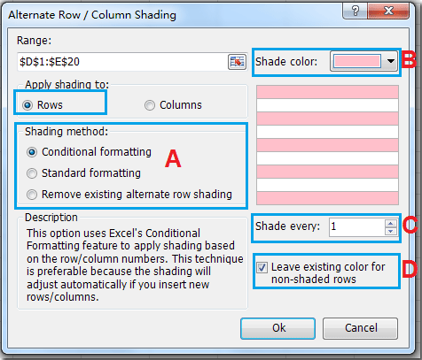
- The Power of Stripes: Instead of using solid colors, you can experiment with patterns, such as stripes, to create a more visually dynamic spreadsheet. Excel offers various fill patterns you can explore in the “Format” window.
- A Touch of Contrast: If your spreadsheet is mostly filled with white space, try using a darker background color for your alternating rows to create a striking visual contrast. This can improve readability, particularly for text-heavy columns.

Image: extendoffice.com
Expert Insights: The Best Practices for Effective Coloring
While we adore a vibrant rainbow of colors, remember that moderation is key! Use colors strategically to enhance readability, not to create a visual overload. Here’s some expert advice:
- Limit Your Palette: Choose a limited color palette, ideally using two to three contrasting colors, to ensure your spreadsheet remains visually appealing and avoids overwhelming your viewers.
- Consider Accessibility: Select colors that are accessible to users with visual impairments. Avoid using overly bright colors or colors that are difficult to distinguish for those with colorblindness.
- Balance is Key: Find a balance between readability and aesthetics. Ensure that your colors don’t clash with the content or obscure important data points.
Excel How To Color Every Other Row
Conclusion: Color Your Way to Clarity and Productivity
Embrace the power of alternating row colors in Excel! This simple formatting trick can dramatically boost your spreadsheet’s readability, making your data easier to analyze and understand. From conditional formatting to the magic of Excel tables, you have a range of options to enhance your spreadsheets and make your work more productive and enjoyable. So, don your colorful cape and unleash the power of organized data!

:max_bytes(150000):strip_icc()/OrangeGloEverydayHardwoodFloorCleaner22oz-5a95a4dd04d1cf0037cbd59c.jpeg?w=740&resize=740,414&ssl=1)


