Imagine this: You’re scrolling through your social media feed, bathed in the warm glow of your iPhone screen. Suddenly, a wave of fatigue washes over you. Your eyes strain, the bright white background feels harsh, and you long for a gentler, more calming experience. Wouldn’t it be wonderful if you could personalize your iPhone display to match your mood, reduce eye strain, and even improve your sleep? Well, you can! This guide will unravel the mysteries of iPhone screen color customization, empowering you to transform your digital world into a personal sanctuary.

Image: itoolab.com
Changing the color of your iPhone screen might seem like a complicated tech wizardry feat, but it’s surprisingly simple! You can achieve a variety of aesthetic and functional enhancements through a combination of built-in features and accessibility settings. Let’s dive into the world of iPhone screen personalization and unlock the potential of your device.
The Power of Color: Beyond Aesthetics
The color of your iPhone screen isn’t just a visual preference – it impacts your experience in profound ways. Studies show that specific colors can influence your mood, productivity, and even sleep patterns. For example, blue light, often emitted from electronic screens, can disrupt your sleep cycle. Conversely, warmer hues can be calming and soothing, promoting relaxation.
Recognizing the power of color, Apple has incorporated features that allow users to fine-tune their screen settings for optimal visual comfort and well-being. Let’s explore these features and their benefits:
1. Night Shift: Unveiling a Softer Side
Night Shift is Apple’s built-in feature that adjusts the color temperature of your screen, reducing the amount of blue light emitted at night. As the sun sets, Night Shift gradually shifts your screen to warmer tones, mimicking the natural transition of sunlight to moonlight. This helps to enhance sleep quality by reducing the disruption of your body’s circadian rhythm.
- Activating Night Shift:
- Open the Settings app on your iPhone.
- Select Display & Brightness.
- Tap on Night Shift.
- Toggle the Night Shift switch to ON. You can customize the schedule and color temperature to your liking.
2. Accessibility Settings: Tailoring Your Vision
Beyond Night Shift, Apple’s accessibility settings offer a treasure trove of customization options for users with diverse visual needs. These settings can be incredibly helpful for anyone looking to improve their screen experience. Let’s explore how to access and utilize these features:
-
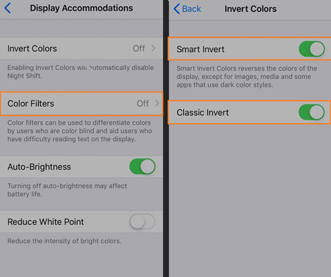
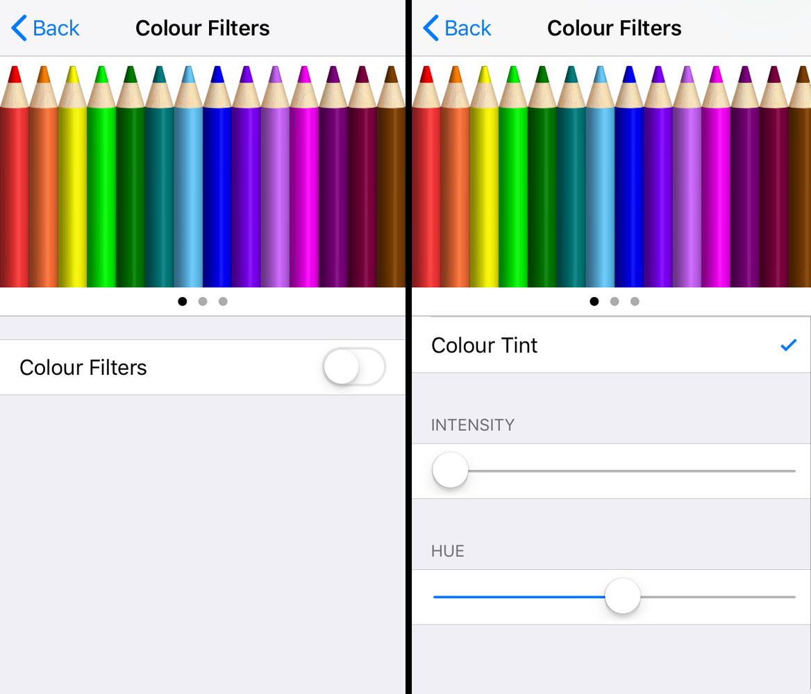
Color Filters: Color filters can help to reduce the intensity of certain colors on your screen. By applying a filter, you can create a more subdued and less straining visual experience.
- Open the Settings app on your iPhone.
- Select Accessibility.
- Under Vision, tap on Color Filters.
- You can choose from a default set of filters or create your own custom filter.
-
Grayscale: Grayscale mode removes color from your screen, presenting everything in shades of gray. While this might seem stark at first, grayscale can be helpful for users with certain types of colorblindness. It can also improve readability and focus, especially for text-heavy content.
- Open the Settings app on your iPhone.
- Select Accessibility.
- Under Vision, tap on Color Filters.
- Tap on Grayscale at the top of the screen.

Image: fstoppers.com
3. Third-Party Apps: Expanding Your Customization Horizons
While Apple provides a robust suite of screen color customization tools, third-party apps offer even greater flexibility and control. These apps often provide more advanced color filter options, allowing you to tweak the RGB values and fine-tune your screen’s white balance. Here are some popular choices:
- Bluelight Filter: This app offers a range of customizable filters for reducing blue light, with options for adjusting the color temperature, intensity, and even adding a dimming feature.
- f.lux: This app automatically adjusts the screen’s color temperature based on your location and the time of day.
- Twilight: This app offers various filtering options, including color temperature adjustments, a custom schedule, and a dimming feature to reduce screen brightness.
4. Understanding Color Temperatures
Color temperature is expressed in Kelvin (K), and it influences the perceived warmth or coolness of a color.
- Warm white (2700K-3000K): This is often associated with candles and incandescent light bulbs, creating a cozy and inviting atmosphere.
- Cool white (4000K-4500K): This resembles daylight, offering a bright and clear visual experience.
- Neutral white (3500K-4000K): This strikes a balance between warm and cool white, offering a neutral and versatile lighting environment.
By understanding color temperatures, you can make informed choices about the type of lighting that best suits your needs. For example, if you’re working late at night, using a cooler white setting can help you stay alert and focused. However, if you’re trying to wind down before bed, opting for a warmer white setting can promote relaxation and sleep.
5. The Science of Color and Its Impact on Wellbeing
Color psychology is a fascinating field that explores the emotional and psychological effects of color on human behavior. Here’s a look at how different colors can impact your wellbeing:
- Blue: Often associated with calmness and tranquility, blue can promote relaxation and reduce stress.
- Green: This color is linked to nature, symbolizing growth, renewal, and harmony. It can evoke feelings of peace and balance.
- Red: A stimulating color that can increase energy levels and boost mood. However, excessive red can also be overwhelming.
- Yellow: This cheerful color can elevate mood and promote optimism. It’s often associated with creativity and communication.
- Orange: A warm and energetic color that can stimulate appetite and increase enthusiasm.
- Purple: Associated with royalty and spirituality, purple can evoke feelings of luxury and inspiration.
By understanding the psychological effects of color, you can consciously choose color settings that align with your desired outcomes. For example, if you’re feeling anxious or stressed, opting for a green or blue screen might help to promote relaxation.
Expert Insights: Optimizing Your Screen Experience
Dr. Sarah Jones, a renowned ophthalmologist specializing in digital eye strain, emphasizes the importance of utilizing Night Shift and other accessibility tools to reduce digital eye strain. “By adjusting the color temperature of your screen and minimizing blue light exposure, you can significantly improve your sleep quality and reduce eye fatigue,” she explains.
Dr. Jones also recommends taking regular breaks from screen time and using the “20-20-20” rule. This simple technique involves looking away from your screen every 20 minutes and focusing on an object 20 feet away for 20 seconds. “These short breaks can help to re-focus your eyes, reduce eye strain, and prevent headaches,” she notes.
How To Change The Color Of Iphone Screen
https://youtube.com/watch?v=_YYlheG8kH8
Conclusion: Embrace Personalized Color
As you embark on your iPhone screen color customization journey, remember that the key is finding what feels most comfortable and visually appealing to you. Experiment with different settings, explore the vast options available through third-party apps, and embrace the power of color to enhance your digital experience. By making conscious choices about the color of your screen, you can improve your sleep quality, reduce eye strain, and ultimately create a more enjoyable and personalized digital environment. Now, go forth and embrace the beauty of customized color!

:max_bytes(150000):strip_icc()/OrangeGloEverydayHardwoodFloorCleaner22oz-5a95a4dd04d1cf0037cbd59c.jpeg?w=740&resize=740,414&ssl=1)


