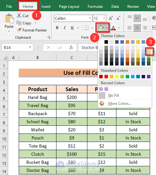
Ever felt your spreadsheets were a bit, well, bland? Have you ever scrolled through a large dataset in Excel, only to get lost amongst the monotony of white rows? Don’t worry, you’re not alone. Fortunately, Excel offers a simple yet powerful feature: **alternating row colors**. This handy tool transforms your spreadsheets, making them visually appealing and significantly easier to navigate.

Image: www.exceldemy.com
In this guide, we’ll dive deep into the world of alternating row colors in Excel. Beyond simply enhancing aesthetics, we’ll discover how this technique can fundamentally improve your spreadsheet’s readability and organization. Get ready to add some visual flair and unlock the benefits that come with it.
Why Alternate Row Colors?
While it might seem like a purely cosmetic feature, alternating row colors in Excel offers a surprising number of benefits for both casual and seasoned spreadsheet users:
1. Enhanced Readability
Think about the last time you scanned a long list of data. Did your eyes tire after a few rows? Row colors add visual breaks, allowing your eyes to rest and focus on each individual row. This improved readability is particularly crucial for longer spreadsheets, preventing eye fatigue and boosting productivity.
2. Easier Data Organization
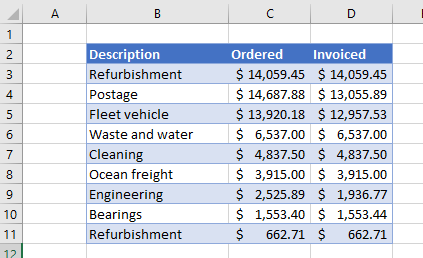
Categorizing and understanding data can be a challenge, especially when dealing with complex datasets. Alternating row colors act as subtle visual cues, instantly differentiating rows and making it easier to differentiate between data points. This is especially helpful when you need to spot patterns or compare values quickly.

Image: www.automateexcel.com
3. Improved Navigation
Ever struggled to find a specific row within a massive spreadsheet? When rows are colored alternately, it’s much easier to track your position. The color bands create visual landmarks, simplifying navigation and helping you locate the data you’re searching for without getting lost in the sea of rows.
The Different Techniques
Excel offers several ways to create alternating row colors, each with its own strengths and weaknesses. Let’s explore these methods:
1. Conditional Formatting
For dynamic and flexible color schemes, Conditional Formatting is your go-to solution. This powerful feature allows you to create rules that automatically apply formatting, including alternating row colors.
Here’s how to use conditional formatting:
- Select the entire dataset that you want to format.
- Navigate to the “Home” tab in the Excel ribbon.
- Click on “Conditional Formatting” and select “New Rule.”
- Choose “Use a formula to determine which cells to format”.
- In the “Format values where this formula is true” field, enter the following formula:
=MOD(ROW(), 2) = 0. This formula highlights every other row based on its row number. - Click on “Format” and select the desired color for the shaded rows.
- Click “OK” twice to apply the formatting.
With this technique, your alternating row colors will update automatically whenever you add or delete rows within your selected range.
2. Fill Color
For simple, static color schemes, the fill color approach provides direct control. You can manually fill specific rows with your desired color. While this method is less flexible than conditional formatting, it’s excellent for smaller datasets or when you need a specific color pattern that isn’t easily achieved using formulas.
3. Using Tables
If you’re working with a table in Excel, it comes with an automatic formatting feature that includes alternating row colors. This feature is a quick and easy solution for visually enhancing your tables. Here’s how to use it:
- Select your data range and convert it into an Excel table.
- Go to the Table Design tab that appears after creating the table.
- Explore different table styles that include alternating row colors.
- Select your preferred style to apply automatic alternating row colors to your table.
Beyond the Basics
While basic alternating row color techniques are valuable, let’s delve into more advanced customization options and explore techniques that take your spreadsheets to the next level:
1. Custom Coloring Schemes
While basic alternating row colors are great for basic readability, you can create stunning and informative visualizations with custom color schemes. Imagine using different color shades to highlight specific categories within your data, or employing various colors to make a visual hierarchy, drawing attention to critical data points. This advanced color manipulation can add immense depth and clarity to your spreadsheets.
2. Alternate Column Colors
Just as you can alternate colors for rows, you can also apply the same principle to columns. This technique is particularly useful when working with datasets that have large numbers of columns, helping you differentiate and navigate the information with ease.
3. Conditional Formatting for Enhanced Clarity
Combine the power of conditional formatting with alternating row colors for truly insightful visualizations. You can define rules that color code specific rows based on data values, creating a visual hierarchy that showcases trends, exceptions, and key data points. For example, you could use red for rows exceeding a certain threshold, green for rows within a target range, and yellow for those that fall below a certain value.
4. The Power of Data Visualization
Alternating row colors act as a stepping stone to more advanced data visualization techniques. Once you’ve mastered the basics, consider creating charts, graphs, and pivot tables to represent your data in visually compelling ways. These techniques unlock a world of insight and make complex information readily understandable for both casual and expert audiences.
Choosing the Right Approach
With all these methods in hand, choosing the best approach for your spreadsheet depends on your specific needs. Here’s a quick recap:
- Conditional Formatting: Ideal for dynamic datasets, automatic color changes based on rules, and flexibility.
- Fill Color: Suitable for smaller datasets, static color patterns, and specific color requirements.
- Tables: Effortless formatting for table-structured data, quick and easy application of alternating row colors.
How To Make Excel Rows Alternate Colors
Conclusion
Alternating row colors in Excel is far more than just a cosmetic tweak. It’s a powerful tool that significantly enhances readability, organization, and data analysis capabilities. By applying these simple techniques, you’ll unlock a visually appealing and user-friendly experience, turning your spreadsheets from mundane to insightful. Experiment with different styles, master the art of custom color schemes, and unleash the full potential of your data with the help of alternating row colors. So what are you waiting for? Embrace the power of color and explore the exciting world of organized and insightful spreadsheets!

:max_bytes(150000):strip_icc()/OrangeGloEverydayHardwoodFloorCleaner22oz-5a95a4dd04d1cf0037cbd59c.jpeg?w=740&resize=740,414&ssl=1)


